

By GUPPI
Networks are everywhere around us. Just by reading this blog post, you traveled across the internet following links to land on different web pages. Your social life is defined by relationships with other people that consecutively are connected to some other people. Nowadays, these friendships are also defined online by social media platforms such as Facebook, Twitter, Linkedin etc. Protein interactions, gene interactions, supply chain optimisation, payments and transactions, even the spread of a disease can be modeled as a network. Therefore the need to analyse this data to derive insights becomes increasingly necessary.
So what do these networks or graphs look like? Well, graphs are composed of nodes representing entities that are connected to each other via edges, which hence represent the relationship between nodes. These edges can be directed (the relationship only goes in one direction: e.g. Twitter user-follower network) or undirected (the relationship goes in both directions: e.g. Linkedin’s connection network). Weights indicating the strength of the relationship can also be assigned to edges.
In this blog post, we will explain some of the more common graph centrality measures which will identify the importance of a node. These measures will be applied and visualised onto a small network (the famous Kite network) and a larger network (Facebook ego network data). Furthermore, to visualise these measures on the larger network, we use Gephi, which is a tool for graph visualisation and exploration. Finally, we will try to detect communities on the large social media dataset.
The data
First, let's start with exploring the data we'll use.
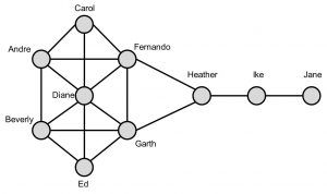
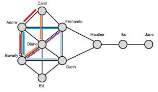
Krackhardt’s Kite network is a small and simple graph consisting of 10 nodes which makes it ideal to show the calculations for the centrality measures (cfr. figure 1).
The Facebook data contains network data from 10 ego networks in total comprising 4039 nodes and 88 234 edges.
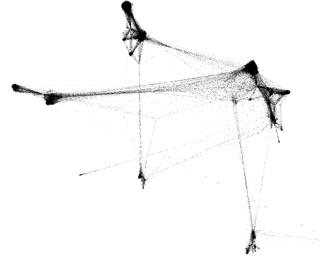
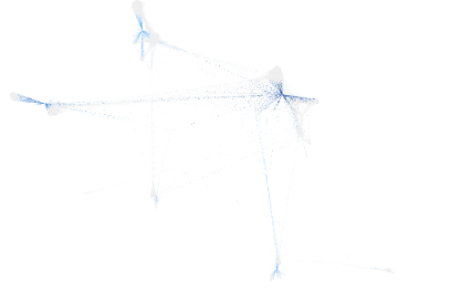
When visualising the Facebook data in Gephi, we first get this beautiful and very useful image:

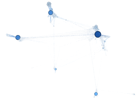
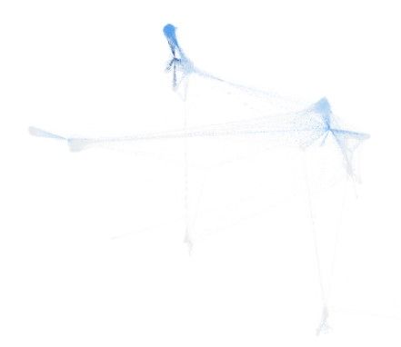
Obviously, we cannot derive any insights here. It is just a square full of black dots. So how can we represent this network better? The answer lies within using spring layout. Spring layout will try to place nodes closer together if they are connected. Gephi has many spring layout algorithms to choose from. We used Force Atlas 2.
Now, we can clearly see some hubs representing friendship circles appearing.

Centrality measures
Degree centrality
The first centrality measure we will discuss is quite a straightforward one. Degree centrality is nothing more than the number of neighbours a node has. In directed networks, this measure translates into two different measures, namely the in-degree and out-degree centrality. In social networks, it essentially captures someone’s popularity.
Looking back at the Kite network, we immediately can see that Diane has the highest degree centrality (degree = 6). This makes her the most active and popular person in the network. Jane on the other hand has the lowest degree centrality (degree = 1). The degree centrality measure can also be normalised by dividing the degree by the maximum degree. In our case, we have 10 nodes so each node can at maximum be connected to the 9 other nodes so the maximum degree equals 9. Consequently, Diane would have a normalised degree centrality of 6/9 = 0.667 and Jane will have a value of 1/9 = 0.111.
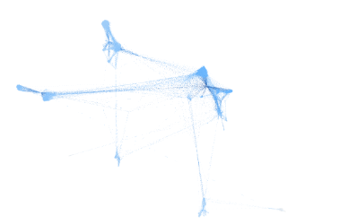
Visualising the degree centrality in Gephi, we increase the size of the nodes with increasing degree centrality and we color the nodes with a darker blue indicating higher degree centrality. We then clearly can identify the densely connected hubs. The biggest nodes are always located in the middle of a hub and represent the main person in that friend circle.
Shortest path and betweenness centrality
To explain the betweenness centrality, we first must introduce the concept of shortest path. A path is defined as a sequence of nodes following the edges from neighbour to neighbour. The shortest path between nodes is then determined as the path traversing the lowest number of edges hence making the fewest hops between nodes.
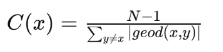
The betweenness centrality is given by the number of times a node appears on the shortest path between node pairs. To standardise, we divide by the number of node pairs in the network, which is given by the formula (n-2)*(n-1) / 2. Nodes with a high betweenness value act as information brokers in the network. They greatly influence the information flow in the network as they easily can alter or filter information flowing to other parts of the network.

Looking at the Kite network, we observe that Heather has the highest betweenness centrality. Indeed, Heather always appears on the shortest paths of the 7 nodes on the left going to the 2 nodes on the right. Hence, Heather appears 2 * 7 = 14 times on the shortest path between node pairs. Standardising this, we divide by (10-2)*(10-1)/2 = 36 ultimately leading to a betweenness value of 0.389. Accordingly, Carol, Ed and Jane never occur on a shortest path and hence will have the lowest betweenness centrality score of 0. This means that Heather has a powerful location in the network. Indeed, she controls information flows/ acts as a bridge between the two parts of the network. Without her, information cannot flow to Ike and Jane.
But how do we calculate this measure when there are multiple shortest paths between node pairs?
Looking at for instance Andre, it will appear on the shortest path between Carol and Beverly and Fernando and Beverly. Furthermore, there are 2 shortest paths (red and orange lines) between Carol and Beverly and 3 between Fernando and Beverly (blueish lines). We thus need to normalise this. The shortest path between Carol and Beverly contributes 0.5 (2 paths) to the betweenness centrality of Andre and the shortest path between Fernando and Beverly 0.33 (3 paths). This will eventually result in a betweenness centrality of (0.5 + 0.33) / 36 = 0.023.
Visualising on the Facebook data, we notice that the nodes in the hubs (light grey densely connected circles) have a low betweenness, whereas the nodes in between different hubs have a darker shade of blue indicating a high betweenness value. This comes as no surprise as indeed these nodes control the information flow and act as bridges between the various hubs.
Closeness centrality
The closeness centrality indicates how close nodes are to the other nodes. This definition is of course not useful as it is stating the obvious. What exactly do we mean by being close to other nodes? A high closeness value is defined as a node on average having short paths to other nodes. These nodes, as they are close to others, can reach all parts of the network fairly fast and hence have the highest visibility in what is going on in all parts. It is calculated by taking the average of all shortest path lengths from the node of interest to every other node in the network:
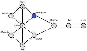
In the Kite network, both Fernando and Garth have the highest closeness value. Let’s calculate this for Fernando (blue node). First, we calculate all shortest path lengths from Fernando to every other node (indicated by the blue number within the node). We sum these values (=14). Hence, the closeness value will be given by (10-1)/14 = 0.643. Similarly, for Jane we will find the lowest closeness value (0.310).
Visualising the Facebook data, we find the highest closeness values between the hubs on the right. Indeed, they are closest to the hubs on the right while still relatively ‘close’ to the hubs on the left. The lowest values we find on the bottom right which represents quite an isolated hub far from the other hubs.

Random walks, eigenvector centrality and PageRank
Previous measures already gave a good idea about the importance of nodes in the network. However, one downfall is that they do not consider the importance of the neighbouring nodes. Let’s be honest, connections to highly influential and well connected people such as presidents are valued more than the connections to very isolated people. Eigenvector centrality solves this disadvantage by considering the importance of neighbour nodes and hence will give you information about the influence a node has within a network.
Basically, links from important and influential nodes are worth more than links from unimportant nodes. Consequently, to gain a high eigenvector centrality value, you should be connected to many people that at their turn are connected to many other people who are also connected to many other people and so on. Obviously, calculating this metric is an iterative process as the value of one node depends on the values of its neighbouring nodes which will consecutively depend on the importance of their neighbouring nodes. Given the iterative nature of the calculation for the eigenvector centrality and PageRank, we will not show the calculations by hand.

The eigenvector centrality is oftentimes calculated using random walkers: the more often a node occurs within a random walk, the more important this node will be as probably this will be a node having many links to other frequently visited nodes. Here, a random walk is defined as a sequence of nodes where you randomly hop from one node to one of its neighbouring nodes.
A variant of eigenvector centrality is PageRank which is an algorithm used by Google to rank web pages in search results. The main two differences here are that PageRank is mainly applied onto directed networks whereas the eigenvector centrality applies onto undirected networks and PageRank uses a damping factor reflecting the probability of jumping off to a random page. Another variant on PageRank is Personalised PageRank. The likelihood of a random walker jumping to another node is not determined entirely randomly anymore, but follows a certain distribution (teleport probability). So certain nodes can have a higher probability of a random walker to teleport to them. This version is often used in recommendation engines.
Community detection
Communities are nodes clustered together in densely connected groups. Within these clusters, nodes are densely connected while having few connections to outside nodes. In social sciences, there is this concept called homophily which means that individuals that share a lot of similarities often form stronger and closer bonds with people similar to them (birds of a feather flock together). Consequently, people belonging to the same community tend to have similar interests and characteristics. Community detection is widely used in market segmentation and recommender engines.
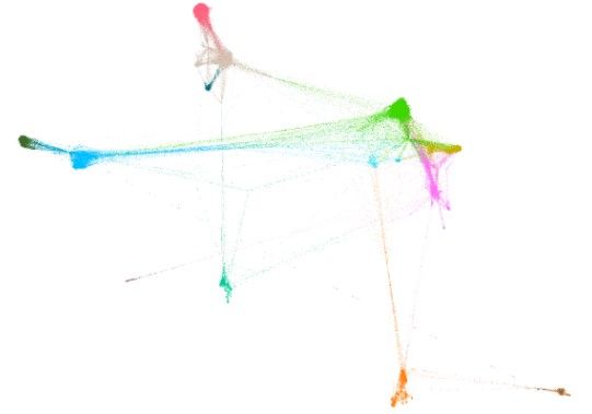
Applying a community detection algorithm (Louvain method) on the Facebook dataset, Gephi identified 14 different communities within the network. These represent densely connected groups of friends. In the figure above, these communities are assigned different colors.
Conclusion
As you probably might have noticed, there is a lot of information hidden in networks. Just by looking at some simple metrics applied onto a social media network, we can identify who is the most popular person, who acts as a bridge between different friend circles, who is the most influential etc. We can even detect whole communities!
Of course this is all super interesting and as these centrality metrics already contain so much information about a node’s position within the network, it might be even more interesting to consider feeding these as additional features to a machine learning model to even further improve its performance.
However, this is not the only cool thing we can do with graph data. We can go even further and make feature embeddings encapsulating information about the structure of the graph and feeding these more complex (but also more informative) embeddings to a machine learning model. This technique called graph representation learning will be discussed more in depth in one of the future blog posts.
You might also like


Resources:
Network Science with Python and NetworkX Quick Start Guide - Edward L. Platt
http://www.orgnet.com/sna.html
https://towardsdatascience.com/pagerank-algorithm-fully-explained-dc794184b4af
https://usableink.com/2017/05/03/analyzing-networks-in-r-centrality-and-graphing/
Image URLs:
http://www.quickmeme.com/meme/35b6bf
https://knowyourmeme.com/memes/you-shall-not-pass
https://nl.wikipedia.org/wiki/PageRank
https://www.dataminingapps.com/2018/06/social-network-analytics-state-of-the-art/