

By Lode Nachtergaele
From casual small talk to deep philosophical discussions, conversations about the weather have permeated our daily interactions for centuries. Its omnipresence in our social exchanges raises intriguing questions about the significance we attribute to something as seemingly mundane as the weather. Renowned philosophers have delved into the subject, contemplating its connection to the more significant meaning of life. In this blog post, we demonstrate that our opinions on weather are often biased and we should occasionally look at the data.
Weather patterns can often be unpredictable, leaving us to wonder whether an extended period of rain is abnormal or within the realm of normal weather fluctuations. We will explore whether the weather following 14 consecutive days of rather wet and cold days in May is unprecedented or must be considered normal.
To determine whether weather is typical, it is essential to have a baseline understanding of what constitutes "normal" weather patterns. Normal weather refers to the typical climatic conditions expected during a specific time and location. However, it's important to note that weather patterns can exhibit natural variations and occasional deviations from these norms.
We will define normal weather based on its distribution derived from historical data. What was the (mean) minimum and (mean) maximum on this particular day over the last 20 years? Luckily this data, provided by the Royal Meteorological Institute of Belgium (RMI), is readily available through the openkmi python package.
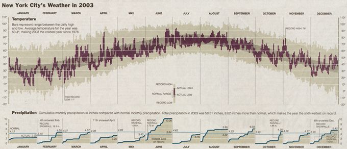
In a recent blog post "Tufte weather in Matplotlib", Cameron Riddell recreated a beautiful weather chart from the renowned Edward Tufte with Matplotlib, the visualization library for the Python ecosystem. Below is a picture of Tufte's original "New York City's Weather in 2003":
With RMI's weather data, we visualize Tufte's chart for the weather with data from the observations in Zavemtem, Belgium since 2004:
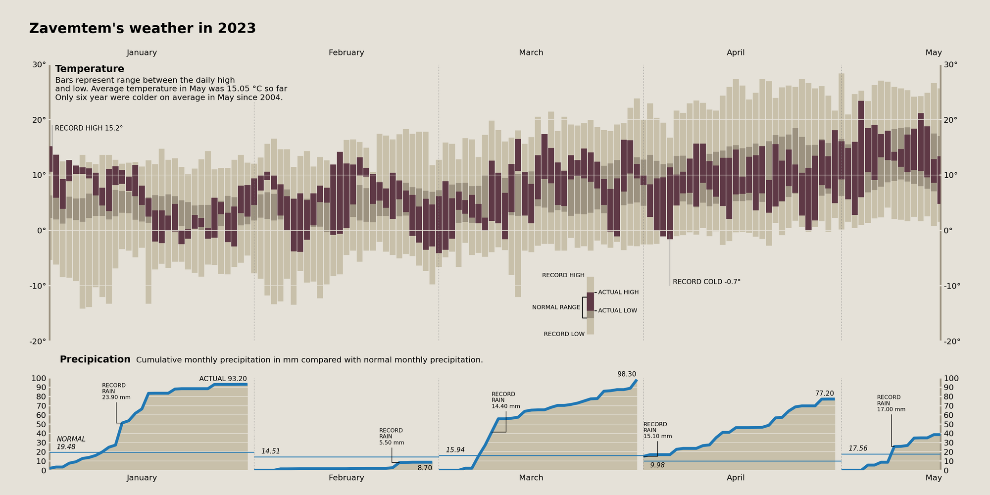
From the chart, we learn that actual temperatures (dark bars) in the first half of May are quite normal compared to the historical data since 2004 (lighter bars). On the contrary, precipitation already reached about 40 mm of rain. More than double the historical mean of 17,56 mm. And we are only halfway through May. Also, January, March, and April exceed considerably the normal cumulative amount of their months. February escapes this trend with a very low 8.7 mm of rain.
Based on the data we conclude that the first half of May has indeed much more rain than on average but temperatures are rather normal so far. We also demonstrate that skillful visualization can make large amounts of data (twenty years of weather data) easy to grasp and hence insightful. Occasionally looking at the data serves as an antidote for biased opinions. As soon as somebody complains about the weather, you may bring up this blog post as an informed opinion!
You might also like


