

By Sophie De Waele, Ben Mellaerts

Many organizations have embraced data reporting to foster a more data-driven culture and democratize data. However, ensuring maximum impact and usability for the organization’s investments requires more than just focusing on the data. In this two-part series, we guide you through a comprehensive end-to-end process, addressing challenges in data reporting adoption. From empathizing with end users to delivering training and support, learn how to transform reporting into a valuable asset.
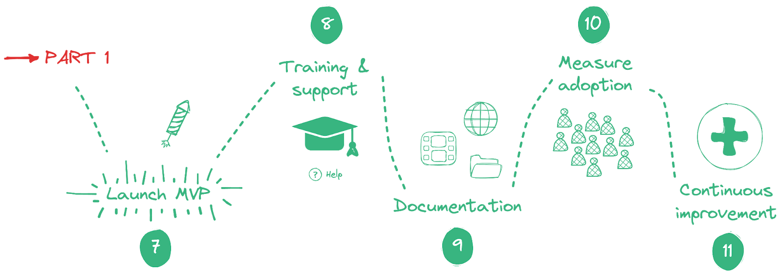
The first part focuses on all adoption initiatives that should be launched in the earlier stages of reporting development. In this second part, the emphasis will be put on adoption initiatives in later phases. Specifically, we will discuss the following topics (starting from step seven since the first six steps are included in part one) :
7. Launch the MVP dashboard
8. Train end users
9. Provide different sources of documentation
10. Measure dashboard usage
11. Gather feedback and continue to improve the set of dashboards
7. Launch the MVP
The release of a Minimum Viable Product (MVP) is a milestone in the dashboard's development cycle. When the first version of this new data product is available in production, accessible to end users, it is time to engage them to start actively using the newly introduced dashboard. Communication, tailored to the audience, is very important in this phase to make all stakeholders and end users engaged. This communication should include what is in it for them and how they can access and use this new dashboard. By scheduling dashboard-specific training sessions shortly after the launch, they can gain hands-on experience from the start.
8. Training
After a new dashboard is launched, training sessions are needed to get all users on board. During these sessions, it should be clear to the users what the advantages are and how it will help their day-to-day activities. Training sessions should be widely available and easy to access and look up later.
The training sessions listed below can be held in two different formats depending on the company culture and prior knowledge: instructor-led or self-paced learning. Each format comes with its own set of advantages and disadvantages. On the one hand Instructor-led training has the advantage of being more interactive and the ability to make the audience more involved. The challenge, however, is finding a date suitable for the whole audience to be present. On the other hand, self-paced learning offers more flexibility to progress through the material at their own pace but is less interactive.
Training can be divided into three types going from more general to more tailored to the new dashboard: data literacy, tool specific, and dashboard specific training.

Data literacy training
Data literacy refers to the ability to read, understand, analyze, interpret, and communicate data effectively. It is a critical skill set that empowers individuals not only to ask the right questions but also to understand the results and insights in order to draw the right conclusions.
Training can consist of multiple modules going from basic to expert depending on the specific needs of different profiles, going from understanding what data is and why it is important to how data can support storytelling.
Tool specific training
Tool-specific training should be organized to make people aware of the full potential of business intelligence (BI) tools to explore data visualization and use the dashboard's interactive features to drill down into the data.
Proper training for dashboard consumers includes:
- Introduction to the tools interface and access
- Data exploration and filtering
- Drill down and interactivity
This ensures that consumers, both new and experienced, are equipped with the knowledge and skills required to use these tools effectively. It facilitates the transition from data to insights, reducing the learning curve and enabling users to make data-driven decisions with confidence.
Dashboard specific training
A workshop tailored to the launch of a new dashboard is a crucial step in ensuring its successful adoption. These workshops offer a unique opportunity for users to become familiar with how it aligns with their needs and how it contributes to the organization’s broader goals, in order to accelerate the adoption process. During these workshops, participants can learn how to navigate the dashboard, interpret data visualizations, and utilize the dashboard to its fullest potential.
This dashboard-specific training session should give answers to questions listed in part one “Which questions do you want to answer with the dashboard.”. To answer these questions, the persona and use cases, created in part one, can be used to make everything more tangible. To make this training more interactive and to check if everything is clear, exercises can be linked to every use case to let users try first and allow them to gain hands-on experience.

9. Documentation
Well-maintained and easily accessible documentation is a crucial element in ensuring the effective use and maintenance of a dashboard within an organization. It not only serves as a guide that provides users with the information needed to understand and use the dashboard, but it also helps administrators to facilitate the continuous improvement and handover of information.
The following topics should be covered in the documentation: general information, manual for users, business logic, and technical documentation for administrators. Depending on the size and complexity of your dashboard it is easier to split this documentation up in multiple documents, as users are not interested in documentation only intended for administrators.
- General
Data documentation is a continuous process that should be done throughout the data lifecycle, from planning to maintenance.
1.1 Definitions and Metrics
It's best to document data sources and definitions before or during the data collection phase, and then update and maintain them as the data changes or evolves. Doing this can help you avoid confusion, inconsistency, duplication, redundancy, or gaps. Documenting data sources and definitions early and regularly can keep track of the data origin, validity, and reliability.
1.2 Who to contact (data owner, app owner)
Documenting a clear list of owners and responsible parties (e.g. product owner, data owner, analyst, developer …) eases the communication. This facilitates the users and stakeholders to easily address their questions to the right person.
1.3 Change log
When creating a dashboard, it is a good idea to write a change log. A change log is a chronological list of changes that were included in a specific release or changing requirements. Requirements change over time, documenting and keeping track of those changes can later help in communication with stakeholders.
- Manual for end-users
End-user documentation provides step-by-step instructions on how to use the dashboard's features, understand data visualizations, and troubleshoot common issues. Additionally, it may offer tips and best practices to help end-users maximize the value of the dashboard in their specific roles in order to make informed decisions. Well-crafted end-user documentation not only reduces user frustration but also empowers users to become more self-sufficient in leveraging the dashboard for data-driven decision-making, ultimately contributing to the organization's success.
- Technical documentation for administrators
The technical documentation exists out of multiple parts: code documentation, data model, data sources, refresh frequency, and more. This documentation should be as complete as possible so a new administrator or developer can understand the dashboard completely.
10. Measure dashboard adoption
Measuring the adoption of dashboards within your organization is essential to assess the effectiveness of your efforts and make improvements as needed. In addition to measuring usage, establishing targets for the desired level of usage enables meaningful interpretation of these metrics. Here are some key metrics you can use to gauge dashboard adoption:
- User Engagement:
- Active Users: The number of unique users who interact with the dashboard within a specific time frame, e.g., monthly or quarterly.
- Frequency of Use: How often users access the dashboard. Are they checking it daily, weekly, or less frequently?
- Active Users in comparison with the target audience, my personal favorite, this metric compares the number of unique visitors in a given period depending on how frequently they should visit the dashboard. If this is 100% your goal is achieved and the whole target audience is using your dashboard.
- Usage Metrics:
- Session Duration: The average time a user spends on the dashboard during a single session.
- Page Views: The number of pages or tabs within the dashboard that users visit during a session.
- Most Viewed Pages: Identify the most popular sections or pages within the dashboard to understand which data is most relevant to users.
- Data Interaction:
- Data Filtering/Sorting: Monitor how frequently users apply filters or sorting options to customize their view.
11. Continuous feedback and improvement
Dashboards are living tools that should grow and evolve with your organization to align with changing needs. Introducing new requirements often revolves around meeting new or changing objectives, optimizing performance, or improving usability. To meet these goals, evaluating and improving existing features or introducing new ones are needed. Improving features might include refining data visualization and simplifying the user interface. While adding new features can include additional data sources or implementing new KPIs.
These new requirements can come from various sources like activity logs, stakeholders, or users. Activity logs discussed in the section above can give insight into user interaction. Based on this, actions can be taken to improve this. Stakeholders can be faced with changing business processes or changing regulatory requirements which needs to be taken into account in the dashboard. Meanwhile, users, especially right after the launch when they have been able to use it for the first time, have a lot of questions that can lead to new requirements based on their day-to-day activities.
While the dashboard is launched and even long after this moment, it is important to stay in touch with stakeholders and end users to on the one hand notify them when updates are launched and on the other hand to capture feedback. There are multiple ways to keep in touch with them, via a dedicated channel (e.g. Teams or Slack) or regularly introduce check-ins. A channel can be useful in two ways: posting the latest updates of the dashboard, and Q&A. A check-in meeting can be used to derive insights into the actual usage of the dashboard and changes in the environment it operates.
As discussed in this section, dashboards need continuous improvement for various reasons like low adoption, changing environment, or end-user feedback. When new ideas are on the table, take a step back to try mapping these to the requirements already listed in the first part of this article. By doing this it will be validated if the new steps are needed, and if so if this dashboard is the right place.
Conclusion
In conclusion, making dashboards land successfully in your organization requires a strategic approach. It's not just about creating fancy charts and graphs but about ensuring that the data is accessible, meaningful, and embraced by your team.
In this two-part series, we emphasized the importance of involving consumers throughout the life-cycle of creating a BI dashboard. In the early stages, described in part one, we discussed how clear objectives can be retrieved and how an user-centric design can be created. In this second part, we have dived into the steps taken after a dashboard is developed. Here we stressed the need for proper training, easily accessible documentation, and the need for adoption measurements. In the final step, we observed that fresh requirements may emerge for various reasons. Therefore, it is important to understand that developing dashboards is an iterative and continuous process to meet the needs of a changing environment. These efforts will drive your organization toward data-driven success.